١
٢ weeks
Foundation
Data gathering, legacy review, moodboarding and low-fidelity exploration.
١ / Opening · VisitFootball · ٢٠٢٤
A new approach to football ticket discovery, travel booking and internal operations.
٢ / The Prologue
VisitFootball helps supporters find official match tickets, compare seating options, arrange travel and request personalised football packages. The redesigned platform brought these services together in one product language across desktop and mobile.
The company’s goal was to reduce the complexity between discovering a match and reaching the stadium. A clearer customer journey saved supporters from navigating disconnected services, while the operational workflow gave the VisitFootball team a more structured way to manage requests and prepare tailored offers.
٣ / The Challenge
The previous experience lacked hierarchy, used inconsistent patterns and made the paths between tickets and travel difficult to follow. Before committing to a direction, I studied the legacy product and reviewed P1 Travel and FootballBreak, two direct competitors, comparing how they presented match inventory, travel packages, reassurance and the route from browsing to booking.
On mobile, dense pages and weak scanning cues made discovery especially demanding. The research confirmed that clarity and trust were essential, but also revealed an opportunity for VisitFootball to feel closer to the emotion of match day without sacrificing practical information. These findings shaped the moodboards, low-fidelity concepts and first product hierarchy.
Direct competitors studied in depth
Weeks of early research and exploration

« I stepped back and treated the legacy site as a service map rather than a collection of screens. That shift made the real opportunity clearer: establish predictable paths for people who knew the match they wanted, while still supporting those who needed help planning a broader trip. »
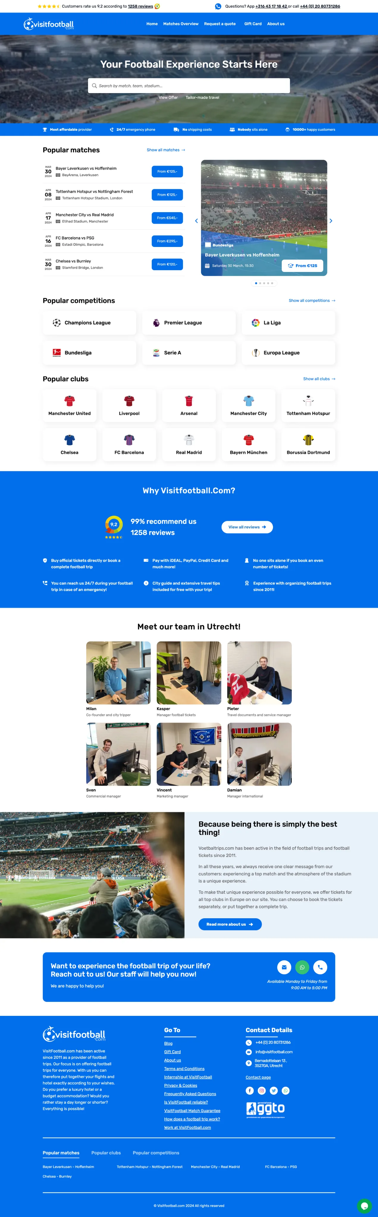
The legacy experience gave competing messages and actions almost equal visual weight, making it difficult to understand what mattered first. Patterns shifted between pages, while the restrained visual language did little to communicate the emotion of travelling for a match. Ticket purchasing, travel planning and support also felt like separate journeys rather than parts of one service. On mobile, those problems compounded: dense content, inconsistent cues and long pages made the experience especially difficult to scan.
Project evolution
Total engagement
About ١ year
٢ weeks
Data gathering, legacy review, moodboarding and low-fidelity exploration.
١ month
Higher-fidelity designs for the homepage and the first core purchasing journey.
٦–٨ months
New pages, VIP travel, personalised quote requests and responsive booking flows.
Ongoing
Developer feedback, edge cases, operational workflows and continued refinement.
٤ / The Direction
I explored two approaches to balance football emotion with purchasing clarity. One prioritised product discovery and credibility; the other used a campaign-led hero and stronger commercial entry points.
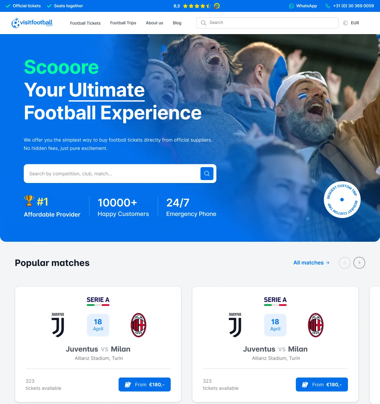
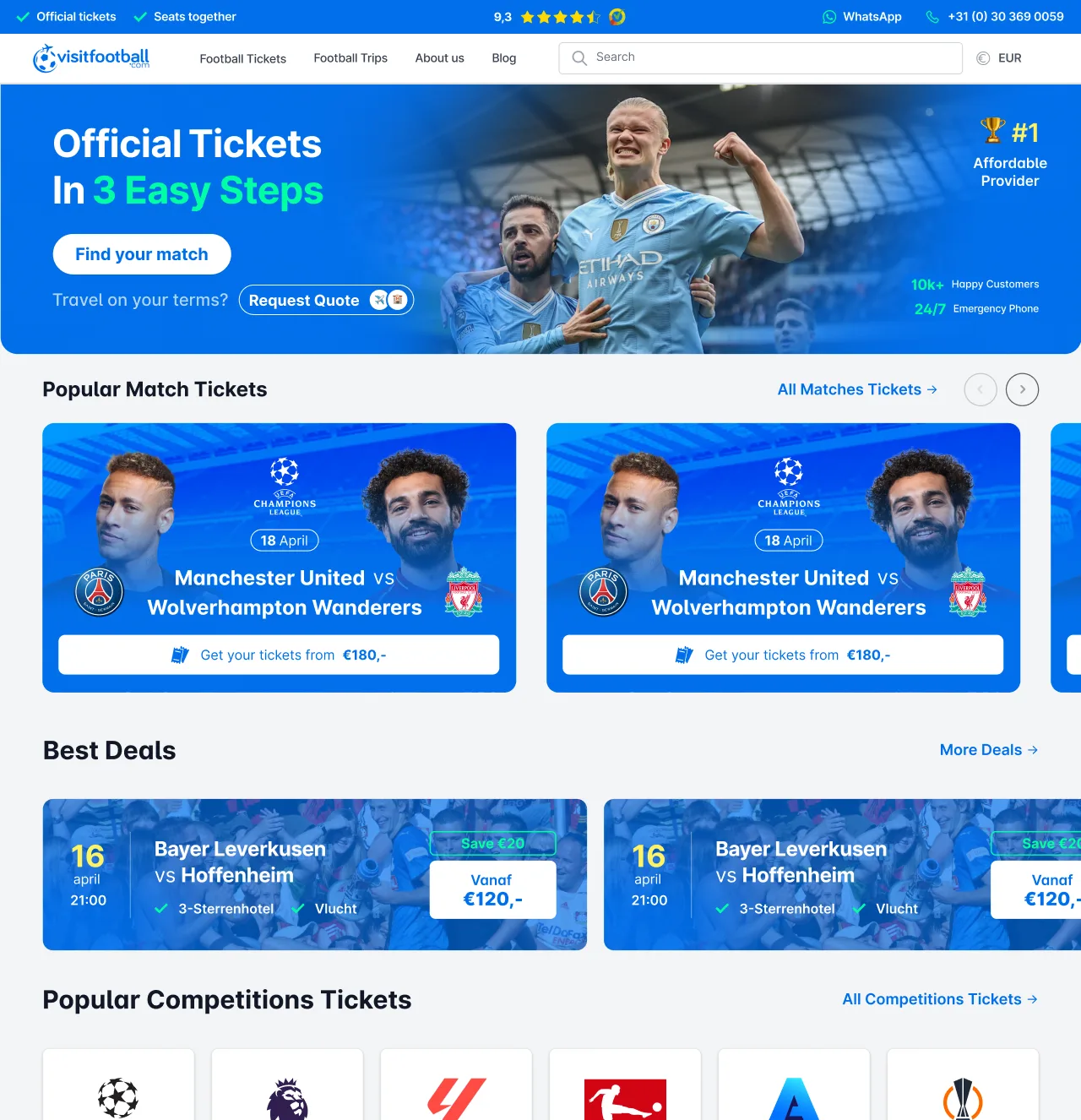
The editorial direction created atmosphere but pushed practical actions too far down the page. The utility-led direction solved that problem, yet felt closer to a ticket marketplace than a premium travel service. The selected design combined emotional context with early access to search, upcoming matches and key actions.
I prefer interfaces where emotion creates attention, but hierarchy decides what the customer can do with it.
From direction to delivery
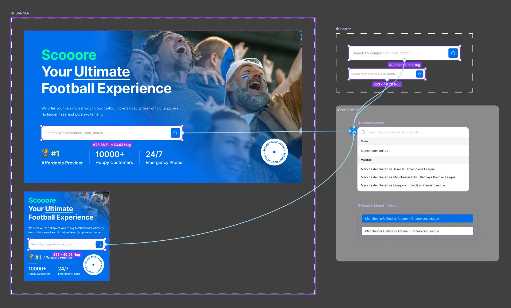
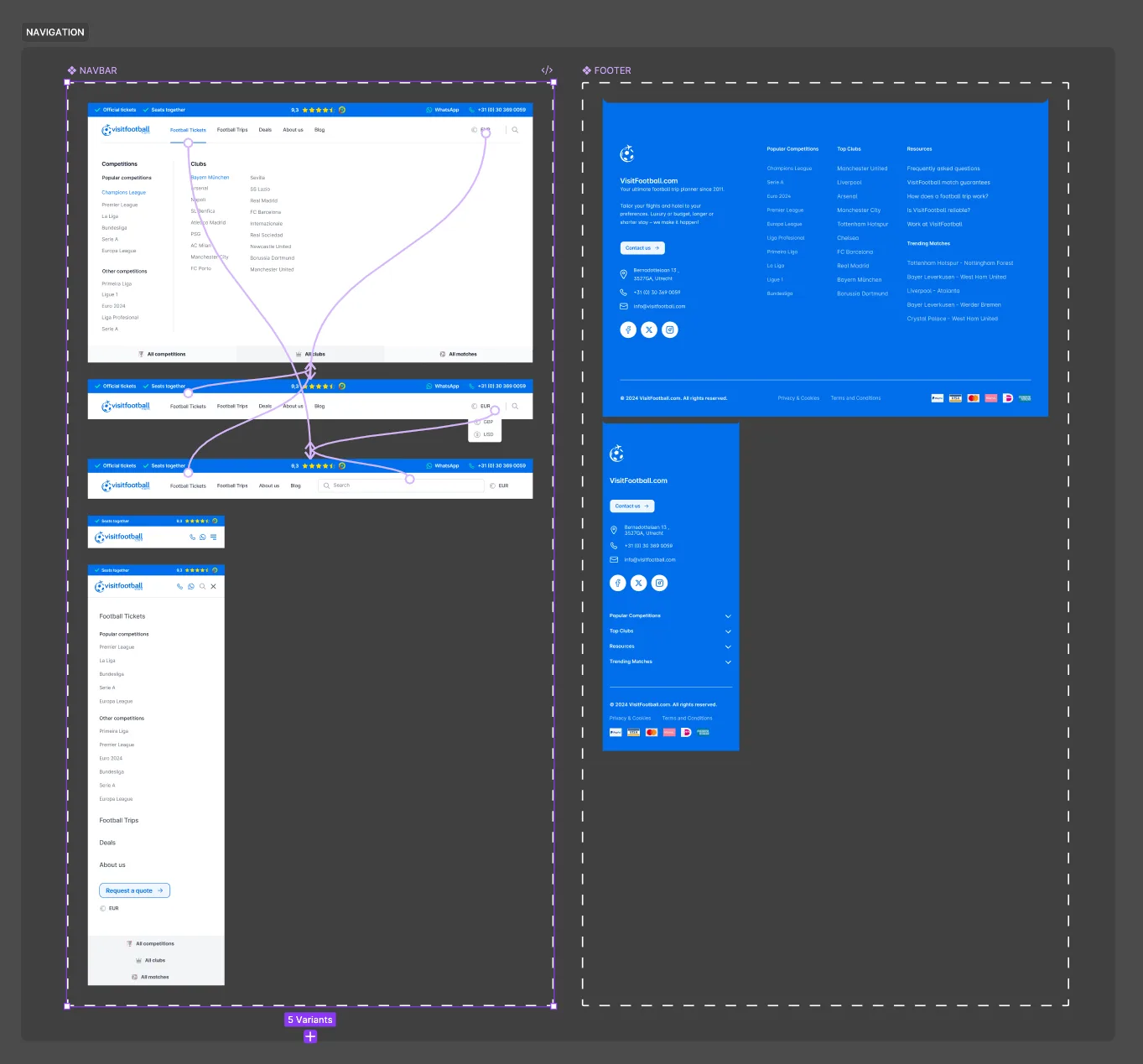
I connected the core components in an interactive prototype, including navigation states, responsive variants and search behaviour. This let the team review the experience as a working journey rather than a series of static screens.
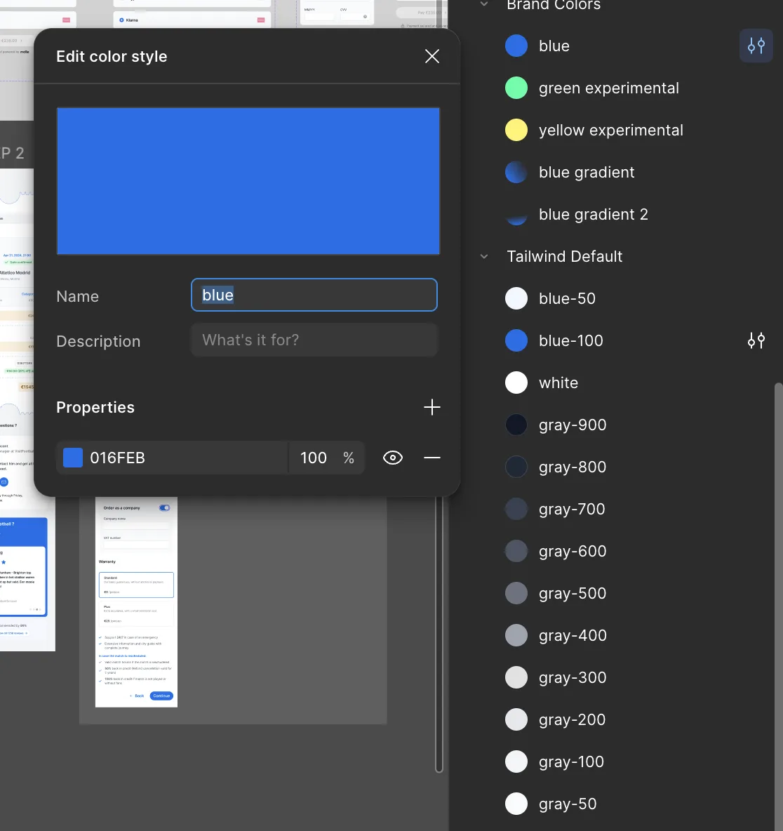
For developer handoff, reusable component variants were paired with custom colour classes built on the Tailwind scale. The shared naming kept brand colours, interface states and responsive behaviour consistent between Figma and implementation.
٥ / The System
I began with a paper sketch to establish the relationship between competition selection, club navigation and available fixtures before translating the structure into the final interface.


١Competitions remain globally accessible
٢Clubs are prioritised by relevance
٣Upcoming matches update in context
I use rough sketches to settle relationships before appearance. If the structure does not make sense on paper, visual polish rarely fixes it.
٦ / The Ticket Selection
The central challenge was retaining as much useful information as possible within the available viewport, without reducing the stadium to a decorative illustration or pushing price and ticket detail out of sight.
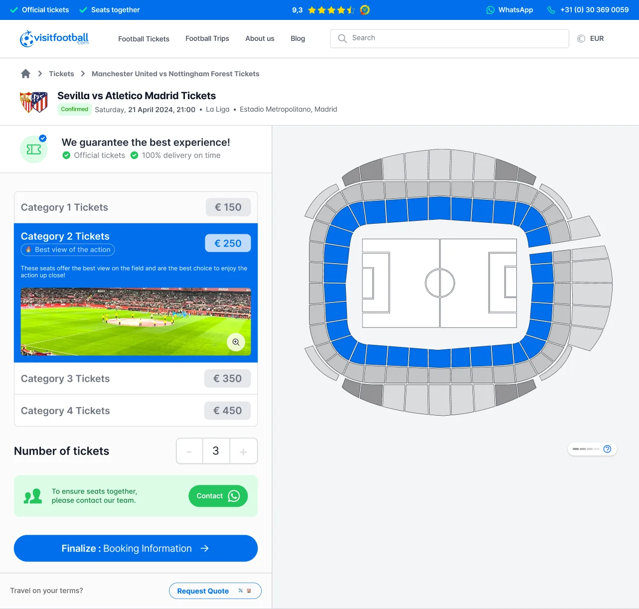
This was a particularly tricky part of the project. The page had to preserve content that supported search visibility and orientation, including breadcrumbs, match naming, venue and competition details, descriptive copy and reassurance, while also exposing the information required to buy. The previous experience contained much of that material, but distributed it vertically. Customers had to move between the stadium, categories, prices and ticket quantity instead of evaluating them as one decision.
I reorganised the component around the interactive stadium. Selecting an area updated the corresponding category, price and seat information, so the map needed enough space to remain understandable and inviting to click. At the same time, category options, ticket quantity, reassurance and the primary action had to remain visible beside it. Developer reviews helped test long venue names, unavailable areas, changing prices and persistent selections within that viewport.
٧ / The Booking
Traveller information, order review and payment became manageable steps. A persistent summary preserved context while support and reassurance remained available throughout the journey.
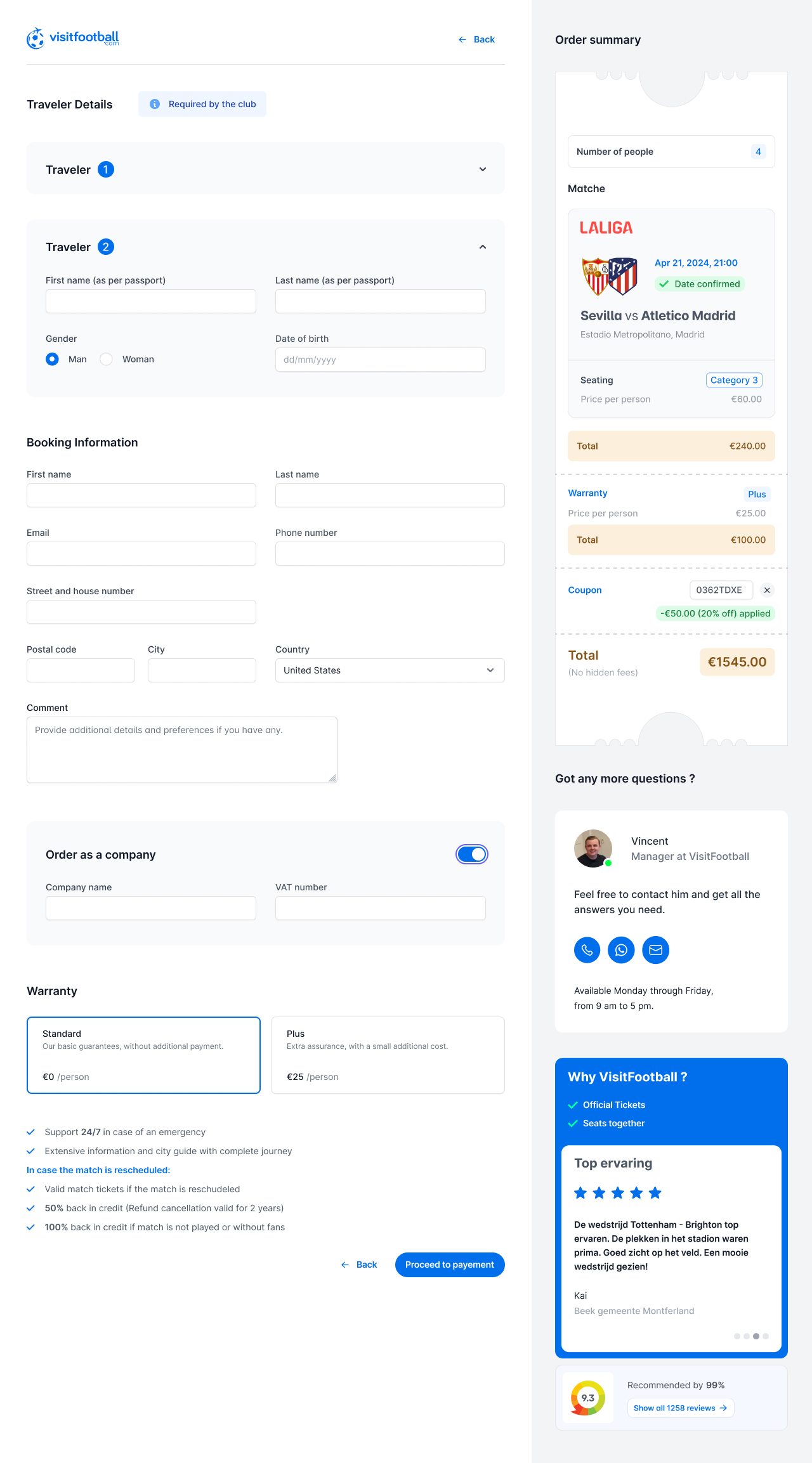
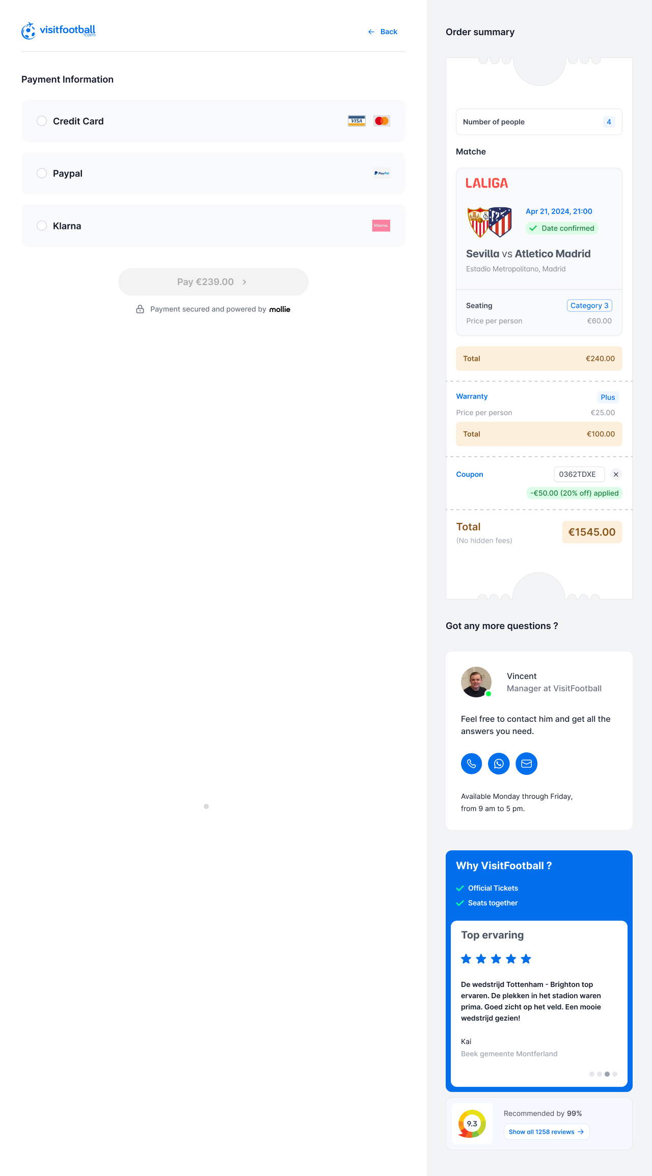
I reduced checkout to two steps: booking details, then payment. Expandable sections supported multiple travellers without repeating the page, while a company toggle revealed business and VAT fields only when needed. Customers could also compare warranty options before continuing.
A persistent summary kept the match, seating, travellers, warranty and final price visible. Manager contact details provided direct support, while official-ticket benefits, external reviews and an autoplaying testimonial added reassurance without interrupting the form.
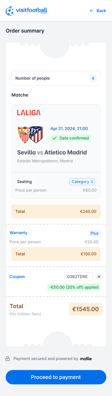
On mobile, the persistent desktop relationship became a deliberate sequence. Traveller details came first, payment methods expanded only when selected, and the order summary remained available as a distinct confirmation step.
Traveller details

Payment
.jpg)
Order summary
٨ / The Travel Experience
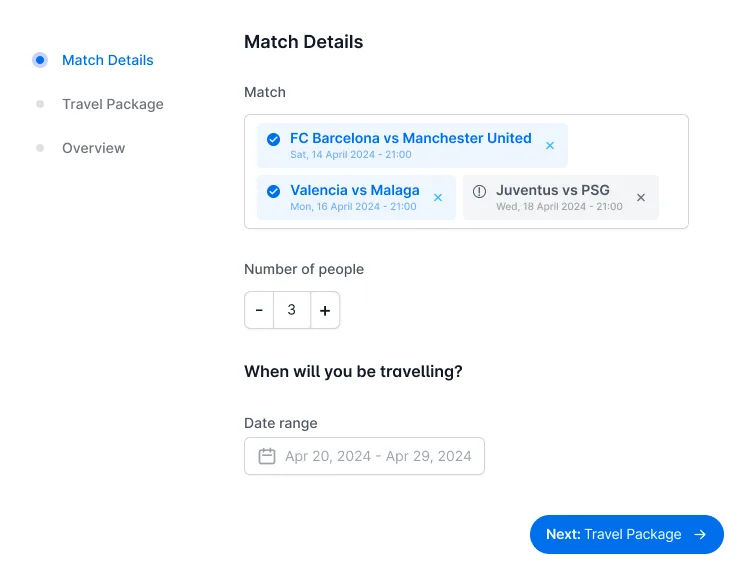
VisitFootball also needed to support higher-value journeys for supporters who wanted hospitality, exclusive access and personalised travel services, not only an immediate ticket purchase.
Establishing the structure
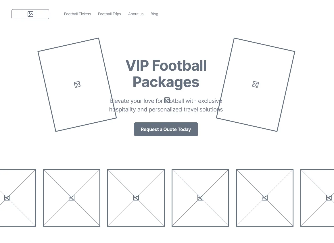
The low-fidelity pass established how hospitality, travel services and package detail could coexist before visual hierarchy and football imagery were introduced.
Final responsive experience
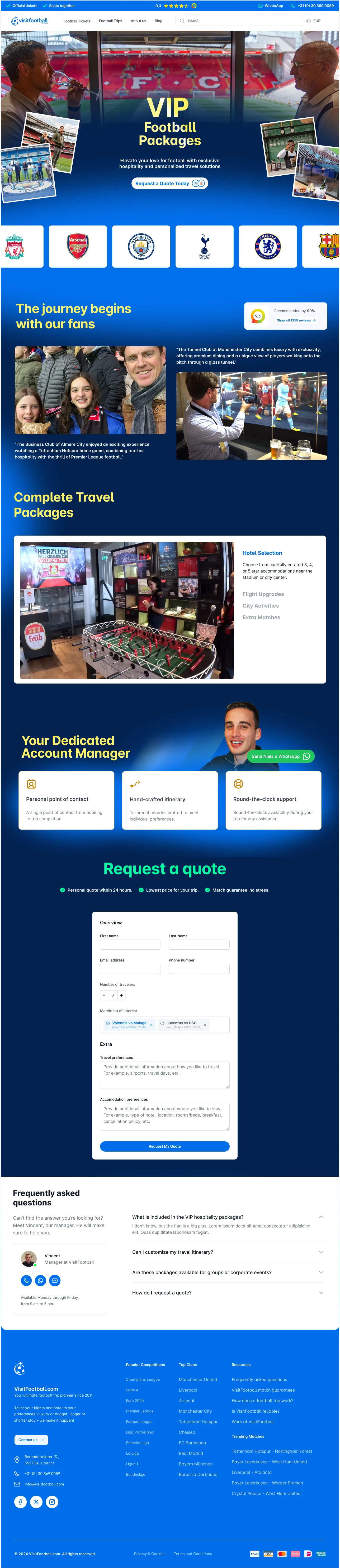

The first version placed every travel field on one page. It was flexible for the business, but demanded too much context too early. Progressive fields kept the initial interface simple and revealed options only when they became relevant.
I favour progressive disclosure when a service is flexible: customers should discover complexity through relevant choices, not confront all of it at once.
٩ / The Operations
This internal experience was designed for the agents who received personalised travel requests. From one operational workspace, they could claim a request, review the customer and traveller information, then prepare the quote that would be sent back to the customer.
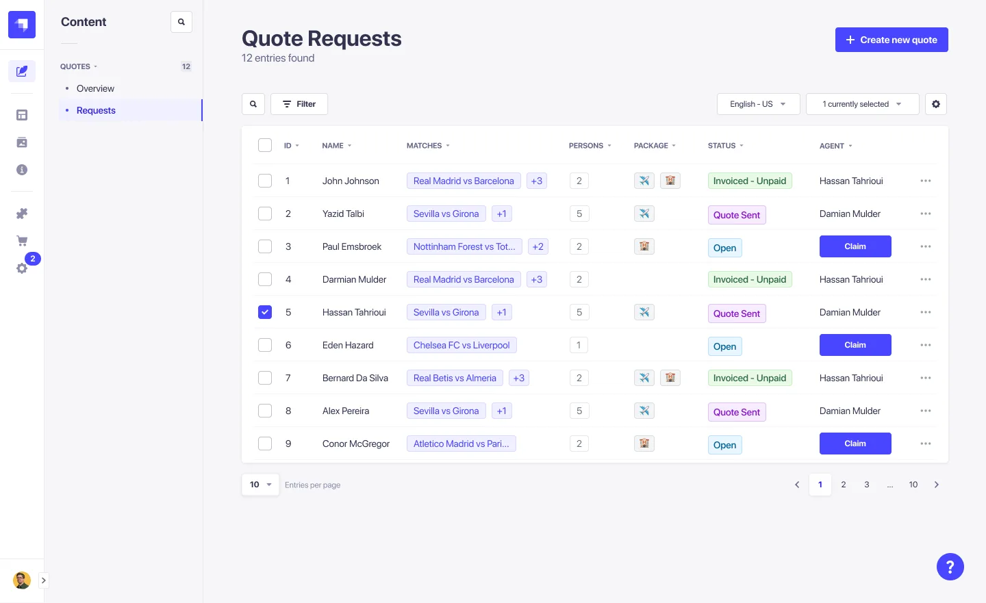
Each request became a working case for an agent. The overview showed its status, ownership, selected matches and number of travellers. Inside the request, the agent could use the customer’s original choices as a starting point, then construct an offer across four parts: matches, flights, accommodation and optional extras. This kept the customer request and the commercial response connected instead of forcing the team to rebuild the context across separate tools.
Agent quote preparation
.png)
A bespoke dashboard offered more visual freedom, but also introduced another interface language and component set to maintain. Strapi was chosen for faster development and shipping, so I worked with developers to separate what its existing system could already support from the custom quote-building behaviour VisitFootball genuinely needed. Extending familiar patterns around request assignment and offer preparation gave agents a clear route from incoming request to a quote ready to send, while keeping implementation maintainable. The client was satisfied with that balance.
١٠ / The Epilogue
“The redesign connected discovery, purchasing and internal operations into one continuous product. Rather than treating marketing, ticketing, checkout and fulfilment as separate experiences, each decision was designed to support the next.Supporters gained a clearer route from finding a match to completing or requesting a trip, while CityTravel Group B.V. gained a more structured way to turn that intent into tickets, travel packages and quotes its agents could fulfil.”